Org Pages
The Scenario
MITRE's Org Pages help employees understand the company's structure and discover expertise across departments. Over time we had ended up with two organization related applications: Org Charts (focused on hierarchical structure and people) and Org Pages (which added information about the organization's projects and capabilities). We wanted to consolidate the two to better highlight organizational expertise and improve usability while reducing duplication and technical debt.
Despite some technical challenges along the way, new Org Pages rolled out with minimal friction, setting a foundation for potential future enhancements.
My Role
I led the user experience of this project from initial concept exploration through implementation. I planned user research to understand how employees used the existing applications, incorporating these insights along with existing feedback into design decisions. I partnered with the product owner to determine MVP features and coordinate the transition strategy, including updates to related products like our People Profiles. Throughout the project, I facilitated stakeholder reviews, wrote detailed user stories, and collaborated with cross-functional team members to ensure successful implementation of the new unified experience.
How We Got There
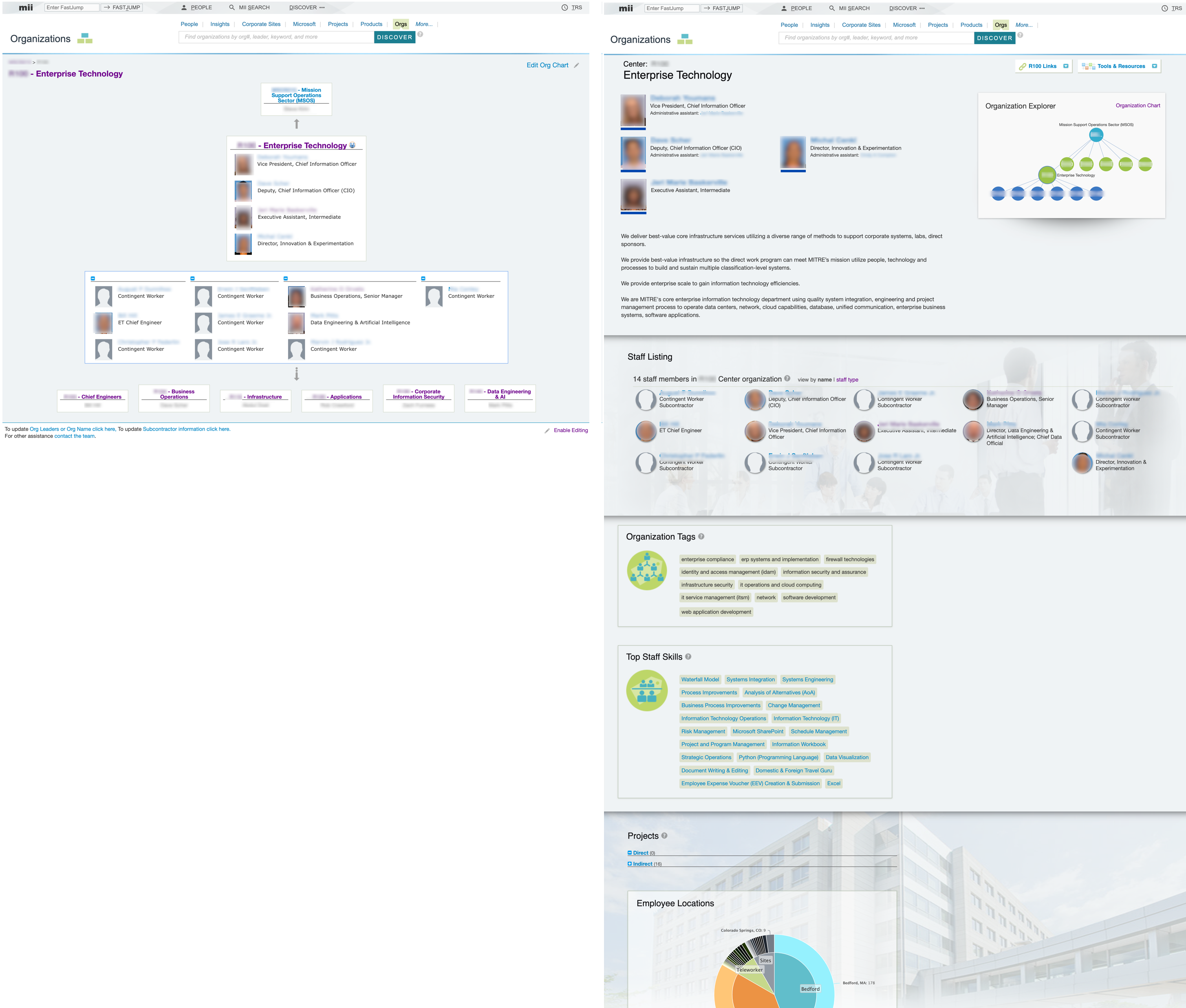
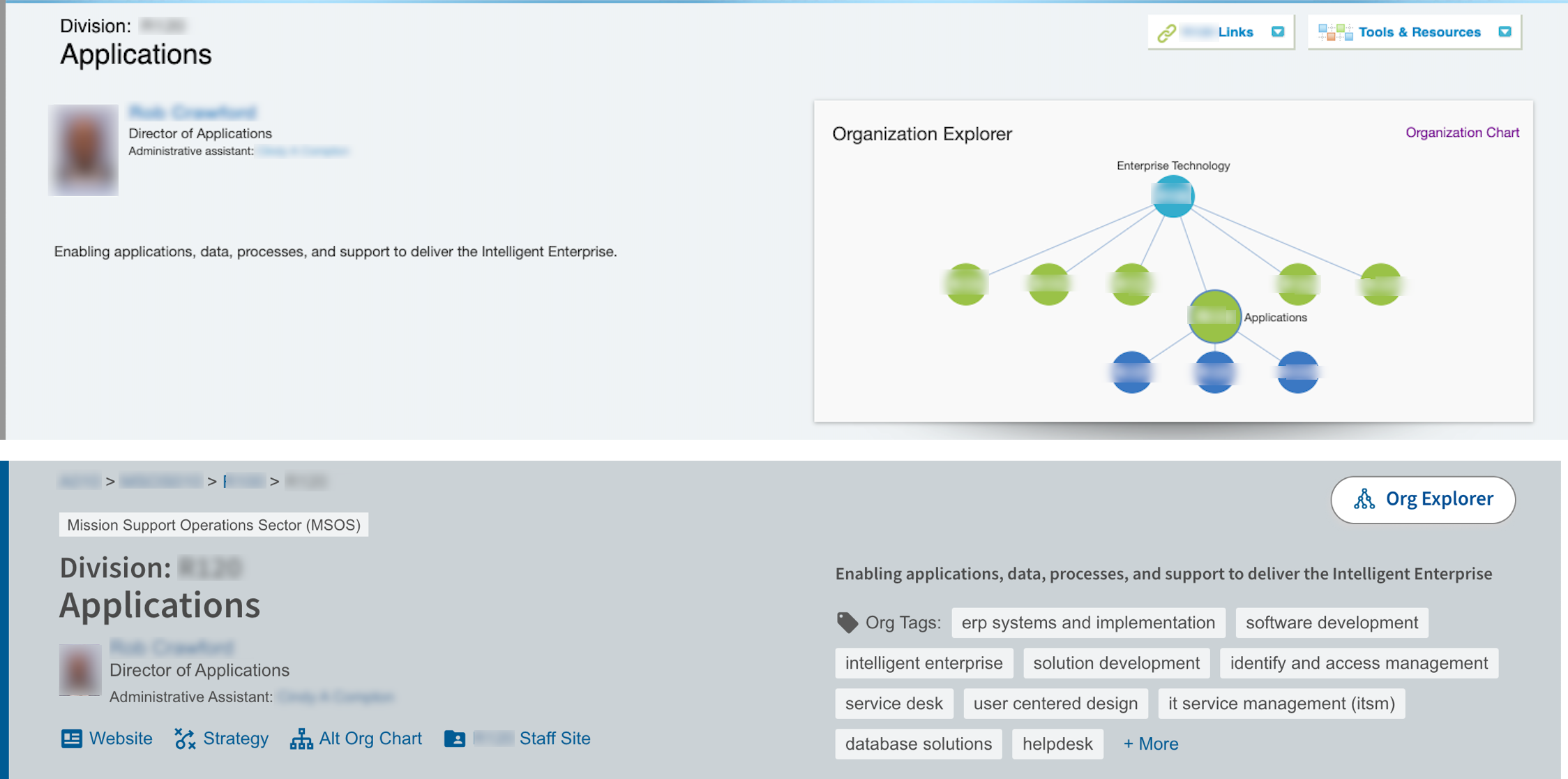
Before starting the redesign, I led a user research study in collaboration with our UX intern to evaluate the existing applications. I designed a hybrid usability test / interview specifically focused on the strengths and weaknesses of their different people + group displays and navigation. The findings showed participants favored the Org Chart's visual presentation of people with clearer boxes for the groups. They also preferred its navigation that included the org leader's name (which may be more recognizable) alongside the org name and number. On the other hand, users appreciated the Org Page explorer graph, especially for navigation to 'sibling' orgs at the same level.
We identified some new usability issues requiring attention, including a counterintuitive first name sort order introduced by changes to our people data. From existing user feedback, I already knew the editing functionality needed to be revisited.
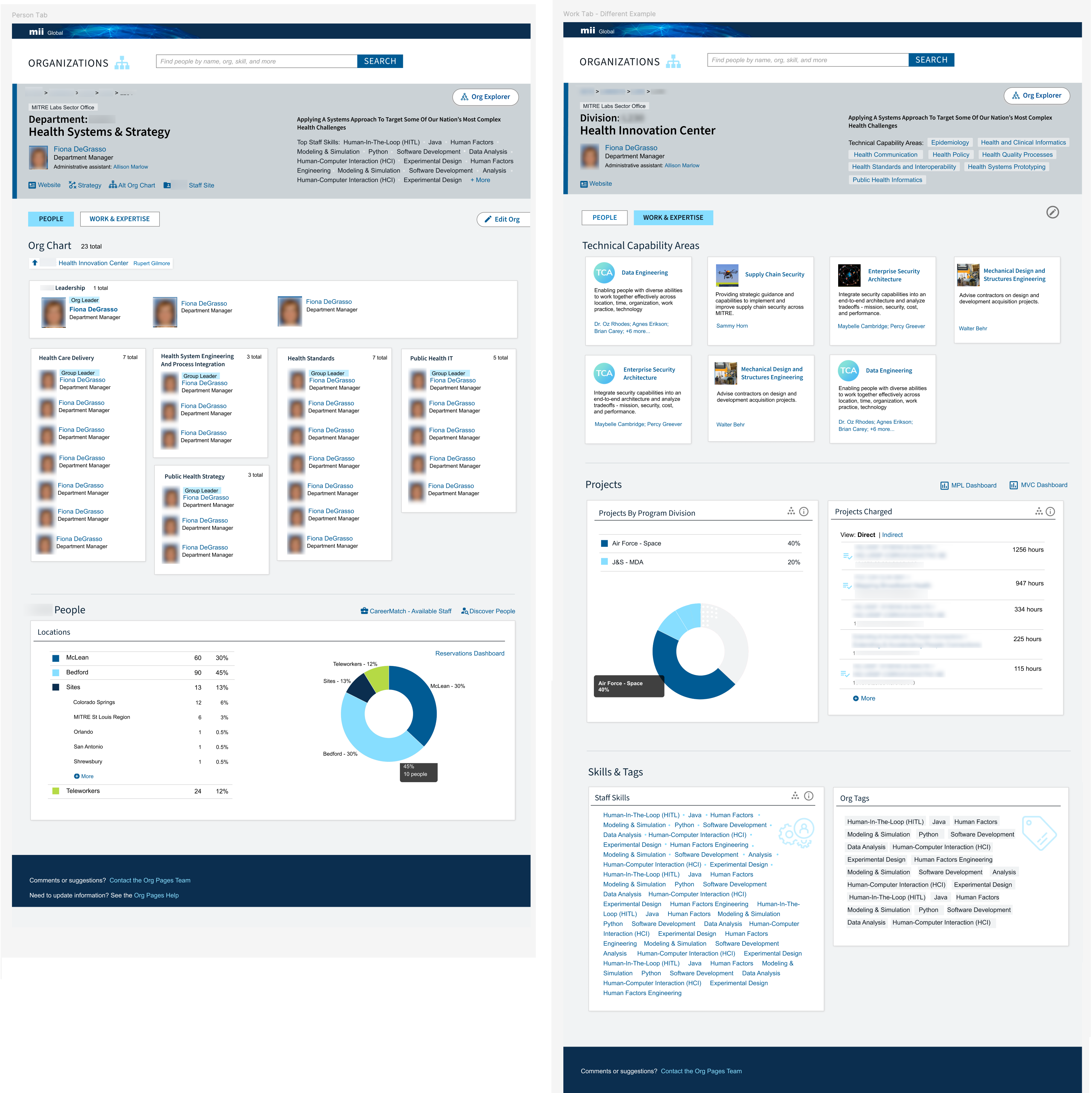
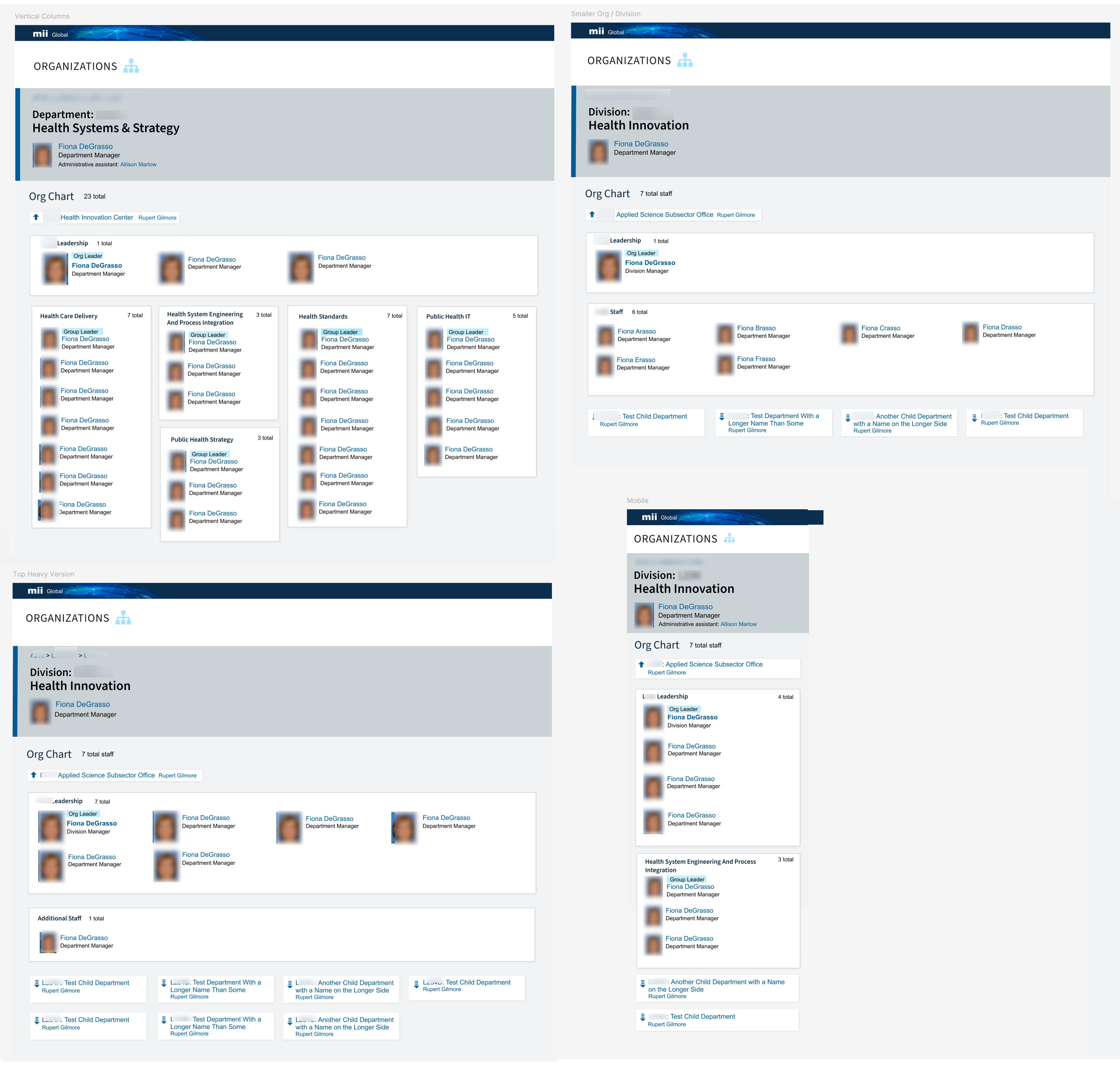
Before developing detailed designs, I created wireframes to establish the organization of the information. I needed to keep in mind variable conditions such as user-populated sections that may not be filled out and content that only applies to certain organization types. I also planned for future ideas from our stakeholders and content I often found during a review of organization SharePoint pages to ensure the application's design could remain flexible and scalable going forward.
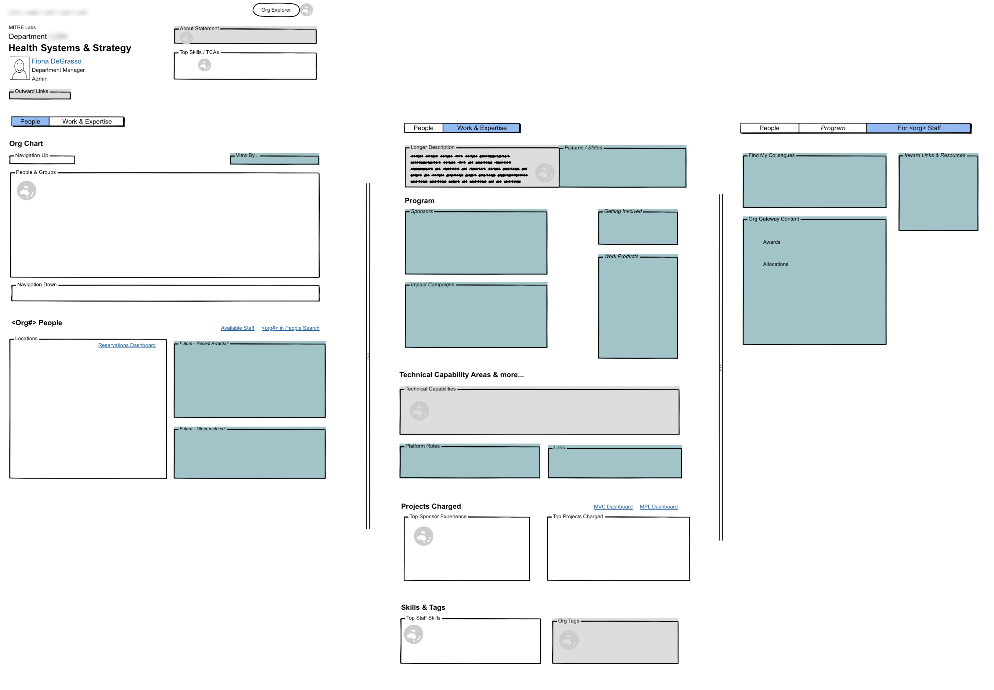
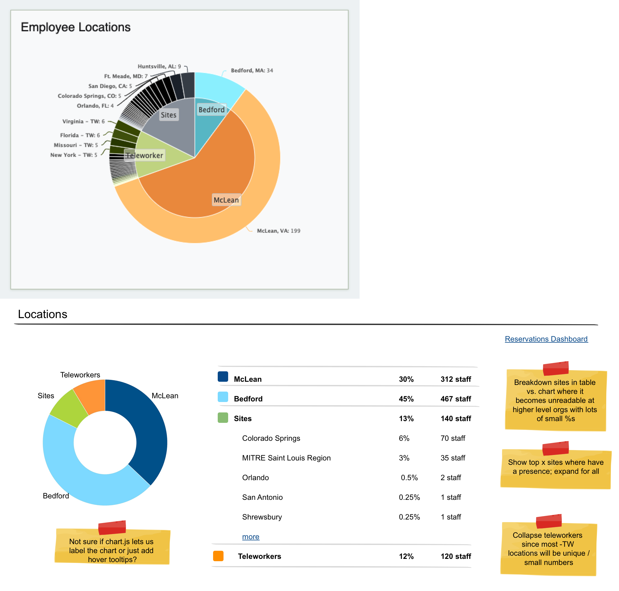
I also set out to improve the usability of the individual Org Page sections. For example, the previous employee location chart could become unreadable, especially when rolling up data from multiple departments. I kept the inner part of the old chart and moved the site breakdown to a more readable table. I deliberately removed the teleworker breakdown as these locations are typically random rather than indicative of a relationship with a nearby sponsor. During implementation I collaborated with the developers to further adapt this design given the capabilities of their usual chart library.
Org Pages needed to accommodate different quantities of data, especially in the org chart section so it could work for both large departments with many groups and smaller orgs with simpler structures or no formal groups at all. While users generally preferred the vertical groups, I stayed horizontal for organizations with only one group and the leadership team to better use the space and keep any child org navigation more visible.
I also simplified and updated the app's editor section by analyzing exports of user-entered data to identify which features were actually being used. This allowed me to replace custom links with a predefined set of popular options such as the org's website. I also redesigned how we'd display the description to better accommodate both brief mission statements and longer multi-paragraph content.
Approved for Public Release; Distribution Unlimited. Public Release Case Number 25-1496
The author's afiliation with The MITRE Corporaton is provided for identification purposes only, and is not intended to convey or imply MITRE's concurrence with, or support for, the positions, opinions, or viewpoints expressed by the author.
©2025 The MITRE Corporation. ALL RIGHTS RESERVED.